When we were deciding how to configure the new spaces in our addition, we knew we didn’t want to expand our kitchen in any way, despite it being miniscule. Some people find a big kitchen indispensable, but what we really lacked in our a-frame was more ample room for living, in general, and entertaining. I absolutely adore cooking and gathering around a table sharing food and wine with loved ones, so it was a priority to squeeze a dining space into the floor plan however we could! The downstairs level of our addition is essentially a large, open space, with a half-bathroom, guest/laundry room and media room off of the “grand room”. I’ve already shown you the living room portion of the open space, and today I’ll be sharing the dining area, which is contiguous to the kitchen. Admittedly, it is a bit of an unusual space because it is where the addition meets the original structure, so there was a rather awkward, angled wall to contend with. Let me show you what I mean:

The wooden paneling you see in the background is actually the roof of the a-frame, stripped of its shingles. Also, we had a new HVAC system installed to service both the old and new structure, and as a result, unsightly duct work was also something else we had to contend with in that already odd space. Because the dining room is actually a bit on the small side, we decided to construct huge built-ins (using builder grade bi-fold doors) to plumb out the wall, which would ultimately be super functional for housing all of our dishware and related dining accoutrements. So this is how the process went:
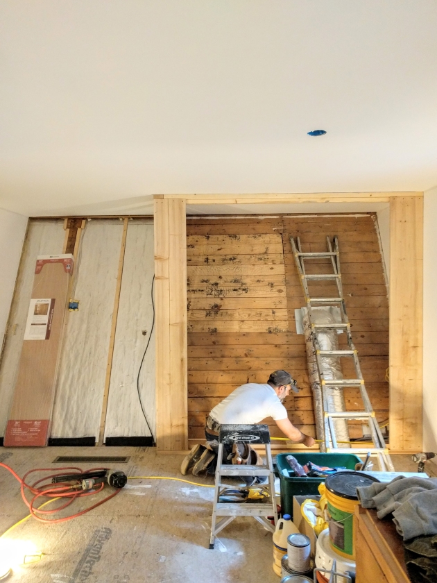
First, we framed out the built-ins. The opening between the a-frame and the dining room is on the left; we were only able to demolish the wall after the photo shoot for this post, but for purposes of understanding the layout of the space, that is actually the passageway into the kitchen.

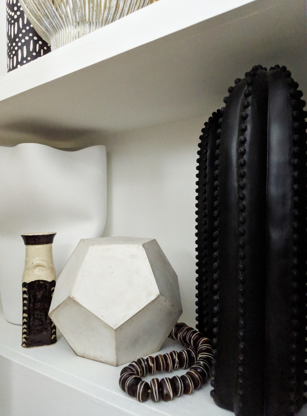
So much geometry involved in framing these out! But it allows for so much shelving and storage space for the embarrassing amount of glasses, transferware and tabletop accessories I’ve collected/horded over the years…haha! Oh, and the duct work was enclosed in a cabinet, out of sight but accessible if the need arises.

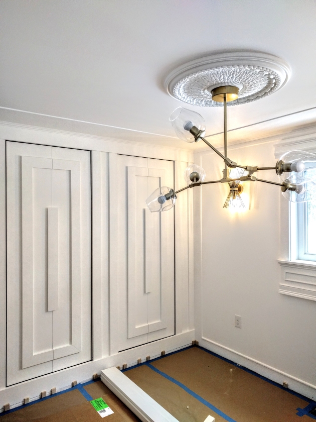
Bi-fold doors in place. Now, time to customize with our own design! Lots of trim work at play here, especially because we didn’t want to incorporate hardware for opening the doors.

And then, lots of patching, sanding, priming and painting ensued.

An ornate ceiling medallion was installed as well. I wanted the space to feel both eclectic and elegant with a few special touches via the lighting choices, and ultimately let the furniture make its impact and serve its function. Personally, I prefer dining rooms which breathe a bit given that there is always so much animation and energy contributed by the people who gather in it!

Fully painted and ready for illumination!
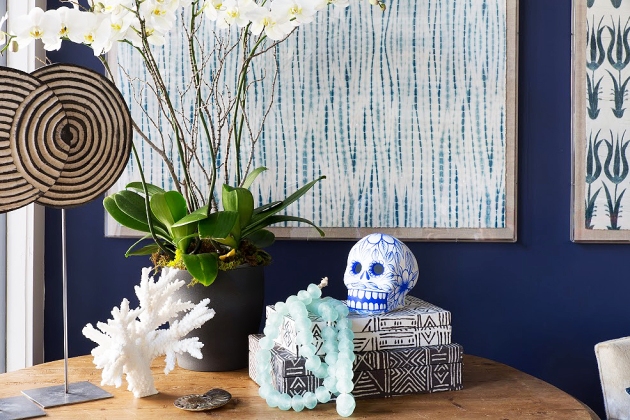
And then the real fun began! As I had mentioned, I wanted to create a chic and airy dining room that wasn’t cluttered with the unnecessary. I chose a bold, Moroccan tribal rug from my collection to provide a bit of visual interest and comfort underfoot, and found the PERFECT assemblage of chairs, table and sideboard from my friends at Raymour & Flanigan to pull our little dining room together. There are SO many things I seriously love about this company, one of them being the sheer magnitude of variety they offer in terms of furniture styles. It’s truly such an asset to their brand! I’m the kind of person who generally appreciates a mix and match approach when it comes to decorating, and this is especially the case in a dining room setting. Meaning, I tend to steer clear of “sets” of any kind. I find that it always feels more unique, personalized and surprising to design a room with a looser and more imaginative approach…because I’m a believer that beauty is always found in the unexpected!
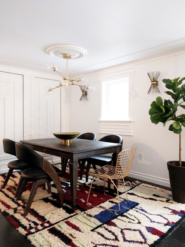
Like I said, I chose pieces which were essentially from four different sets. I wanted a robust, wooden table with unfussy lines and the option of a leaf (for when I’m entertaining bigger groups) and the Sutton Place Dining Table was exactly what I had in mind. It’s seriously perfect, with such a gorgeous patina!
I really wanted to mix up the seating not only in terms of their design, but also material. The masculine solidity of the Prato Dining Armchair, with its striking curvature and incredible craftsmanship, juxtaposed against the wiry, mid-century lines of the brass Penelope Chair provide the perfect contrast I was seeking for this grouping.


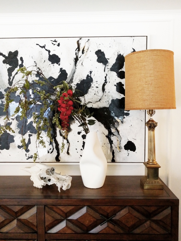
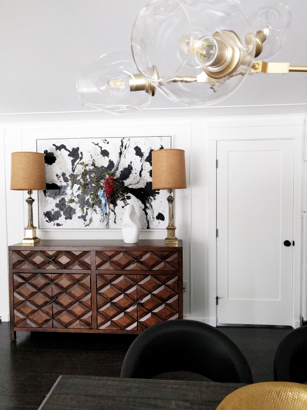
I fell in love with the Echo Park Buffet because of its incredibly handsome carvings and felt that its Brutalist style meshed beautifully with the rest of the chosen pieces. It’s a rather substantial sideboard/buffet offering lots of interior storage and was from an entirely different set, of course, but all of the elements interact so well with each other.

I had painted a canvas specifically to hang over it, which I then flanked with some vintage table lamps from my stash.
And there you have it…the makings of our little dining room which I cannot wait to put to good use and make endless memories in!


- I have partnered with Raymour & Flanigan and received product in exchange for this post. All expressed opinions are 100% my own.
*Images and text by Astrid Insieme