THE EYE WANTS TO TRAVEL – MASTER BATHROOM REVEAL

And so we have FINALLY completed our master bathroom, after a ridiculously protracted build with so many interruptions and delays, as is always the case with DIY operations! Without any further ado, let’s just get to the visuals showcasing the before, during and after, with as brief of an explanation of the process as is necessary to make sense of this rather convoluted project…haha!

So here is a “before” picture of the space where we decided to create our master bathroom. It’s essentially a 5 x 12 foot sliver of awkward real estate that runs parallel to our (unfinished) master bedroom and which meets the angled roofline of the A-frame. Confusing, I know. Because it was even more confusing to carve a functioning room out of this bizarrely configured area…haha! The other intrinsic challenge presented by this space is that it’s windowless, and as such, has a predisposition to feeling a bit cavernous. But as we’ve been renovating our modified A-frame for a few years now, we are more than used to confronting unusual architectural situations and figuring out a way to maximize each potential square foot.

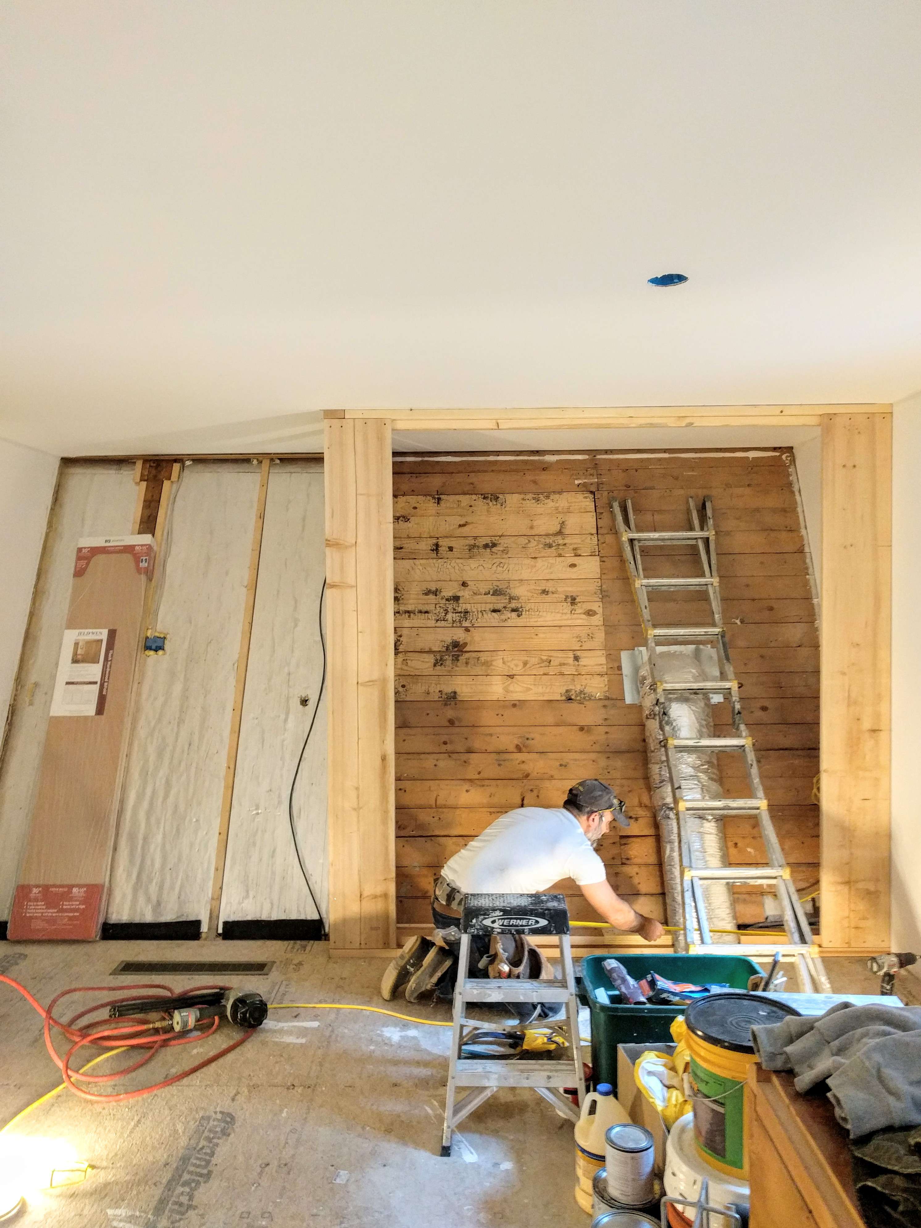
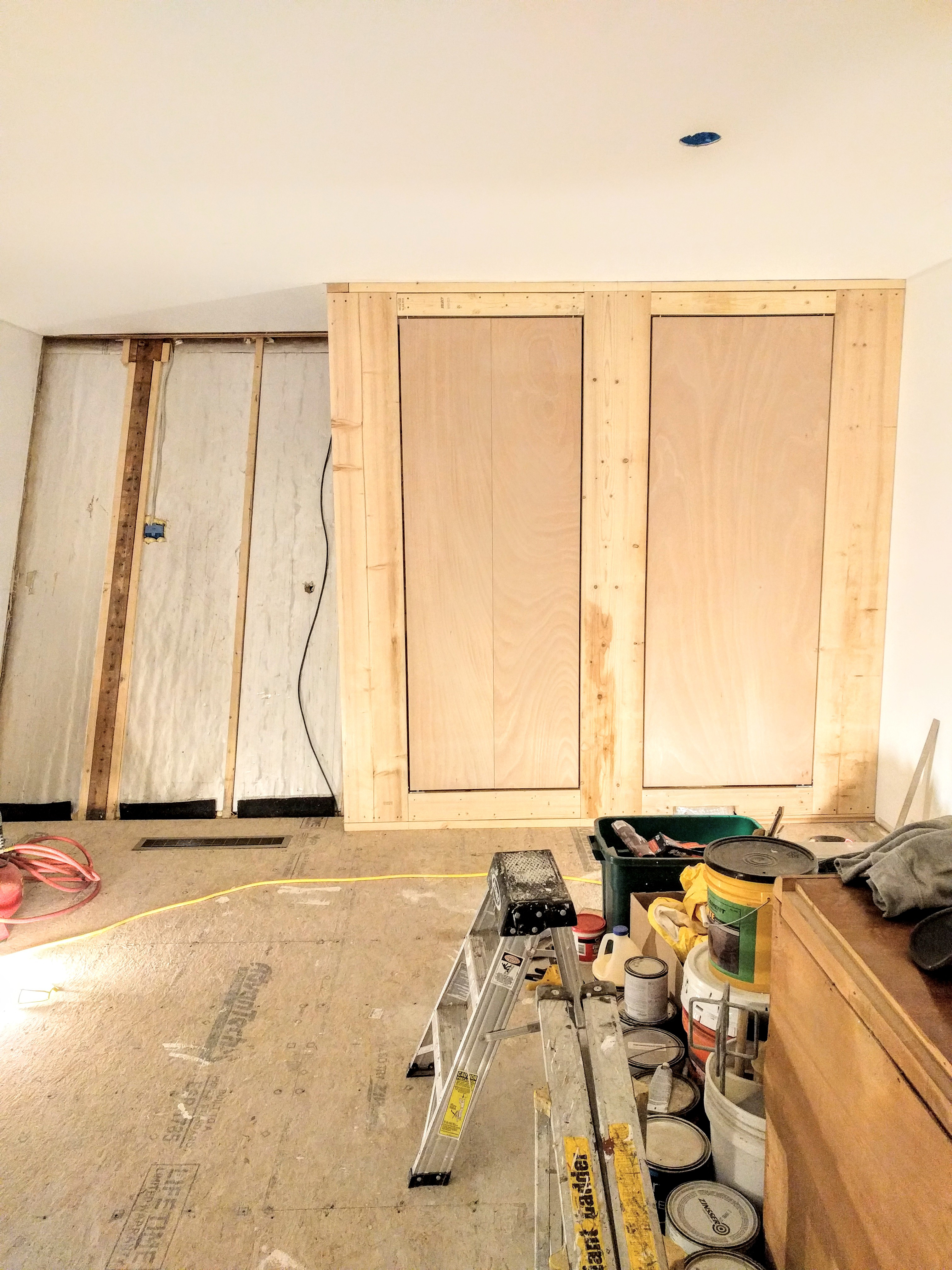
This is the space in a rather early phase, down to the studs. At this stage, we had already inserted the tub and tiled the surround though, as well as completed the electrical installation and plumbing rough ins.

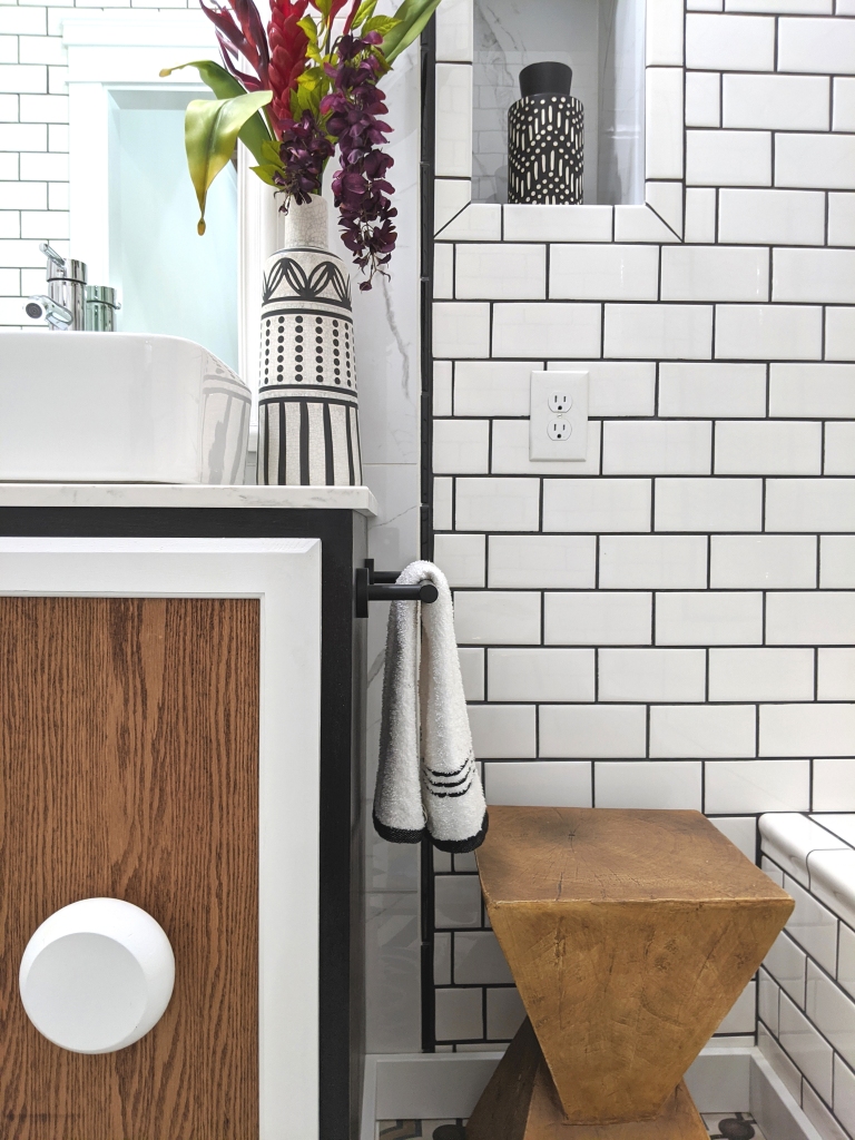
In the above photo, you can see the steeply angled roofline of the A-frame on the left, and how this space is contiguous. We decided to plumb out the walls and take advantage of the unused cavity by creating some recessed wall niches as well as an inset storage cabinet.

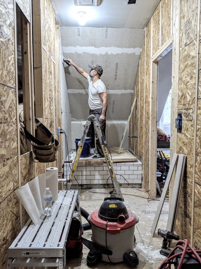
And so the real construction begins! Walls are sheathed and up goes the cement board as the plan is to tile the entire bathroom, from floor to ceiling.

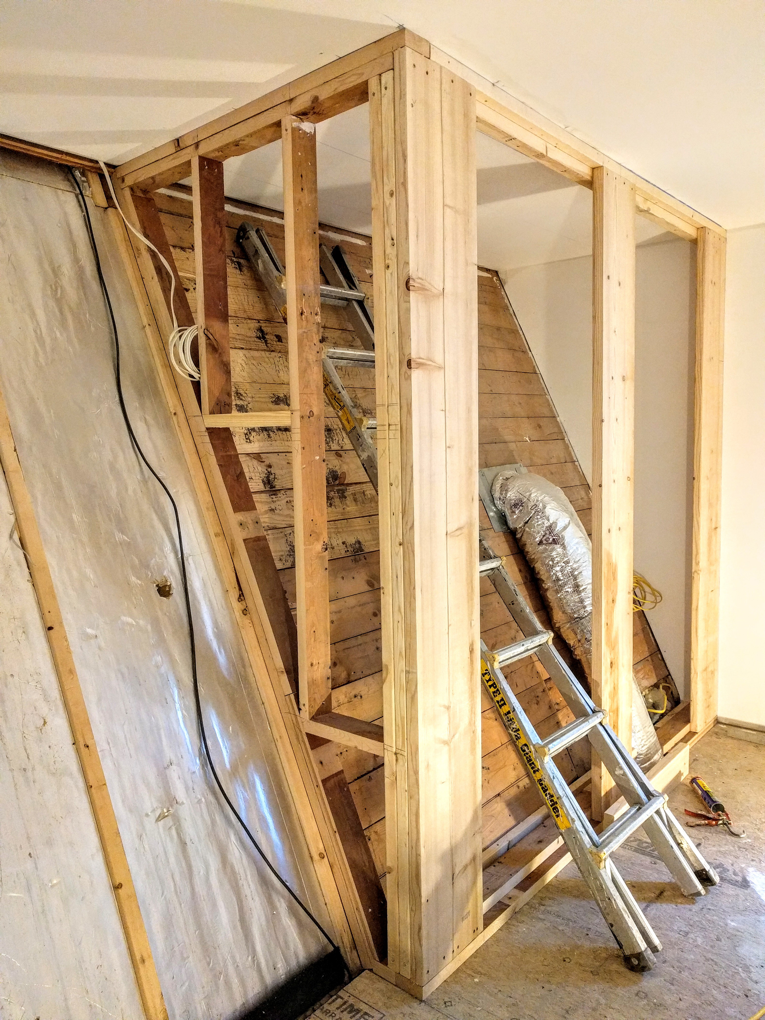
Building out the recessed niches and inset cabinet between the A-frame roof and the bathroom walls in what is possibly one of the most unforgiving work spaces…haha! Honestly, I can’t even begin to describe the extent of the construction weirdness we encounter here on the daily.

Making some headway…

Here, things have started to take some shape, as the cement board has been fully installed and the tiling has commenced. Ah the joys of endless tiling…

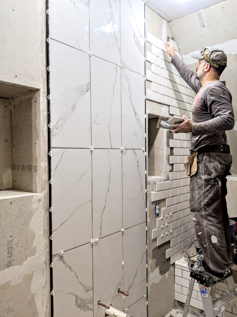
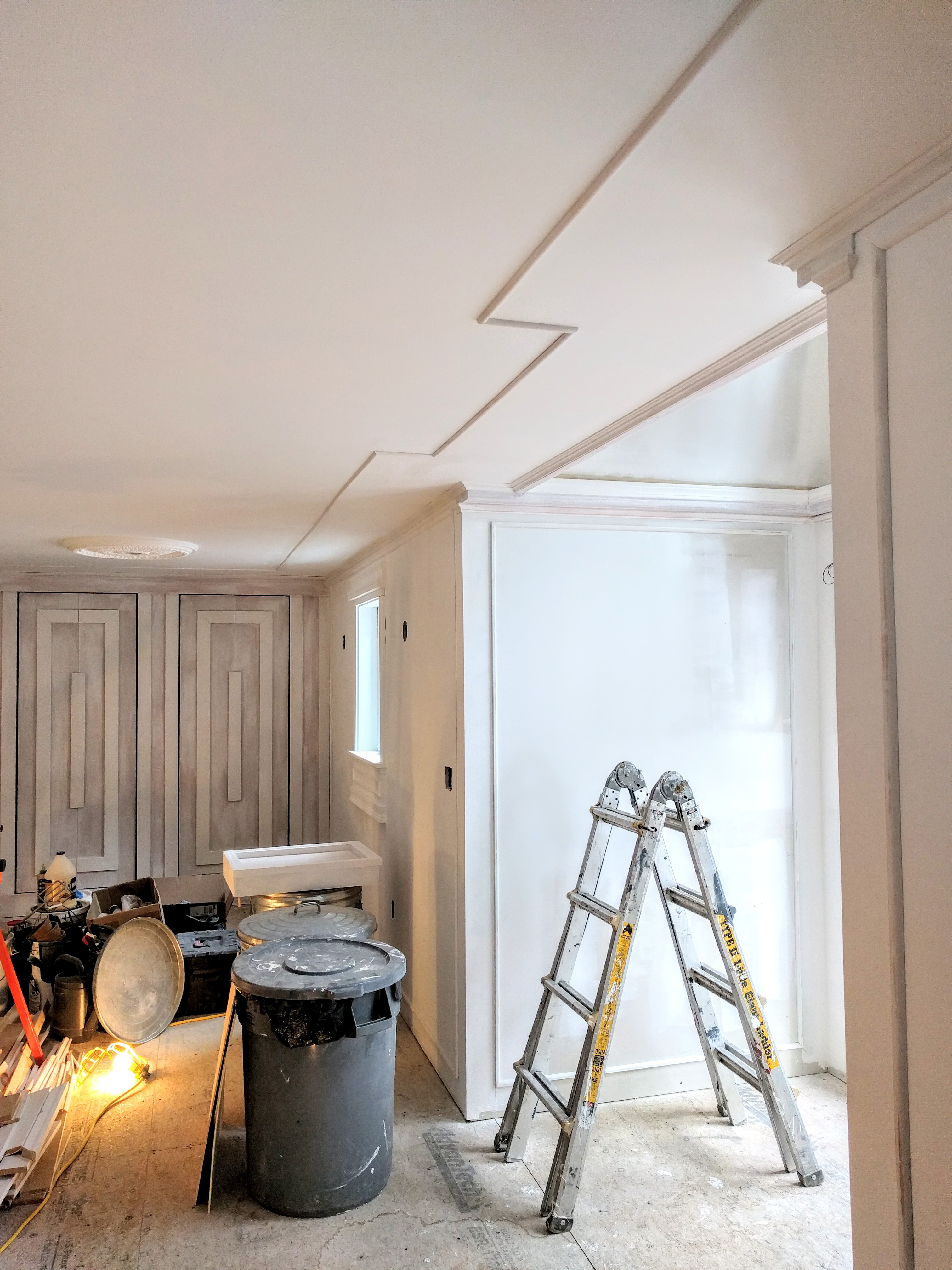
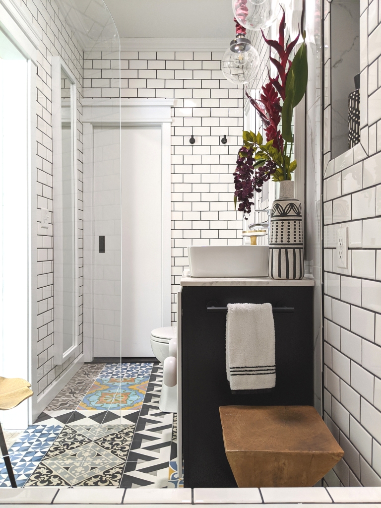
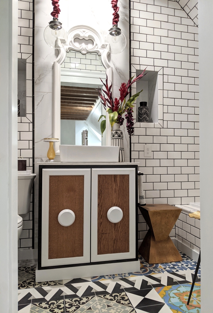
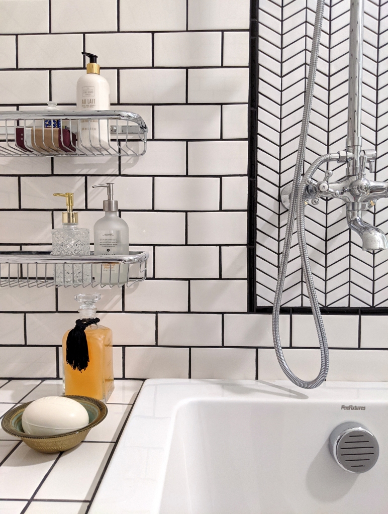
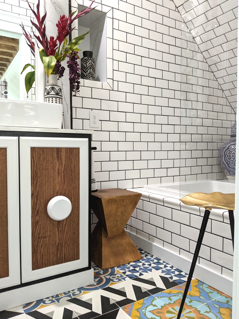
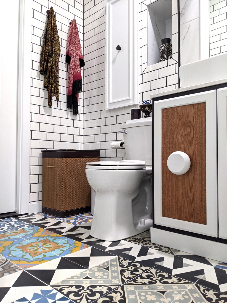
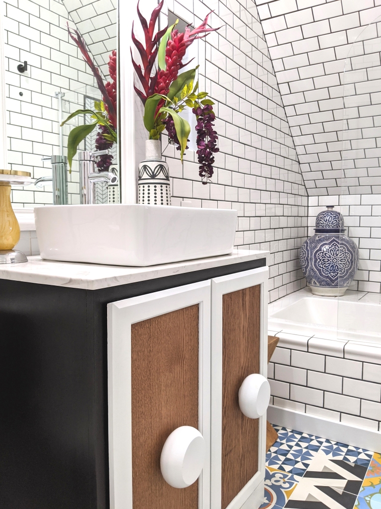
Because the bathroom has no natural light source, I opted for white subway tile and marble panels throughout (with the occasional black trim detail) so as to keep the space from feeling too much like a dungeon. I ultimately wanted this bathroom to feel elegant and airy despite its obvious limitations, but with a deliberate injection of drama because that’s just how I like my interiors. And I truly believe that small spaces, bathrooms especially, benefit from a well administered dose of the dramatic!

Oh, and if you’re curious as to how and where we have our tools set up while we work, let us please have a collective moment of silence for the sad, sad state of our (future) master bedroom. Which continues to serve us well as a makeshift construction yard…haha!

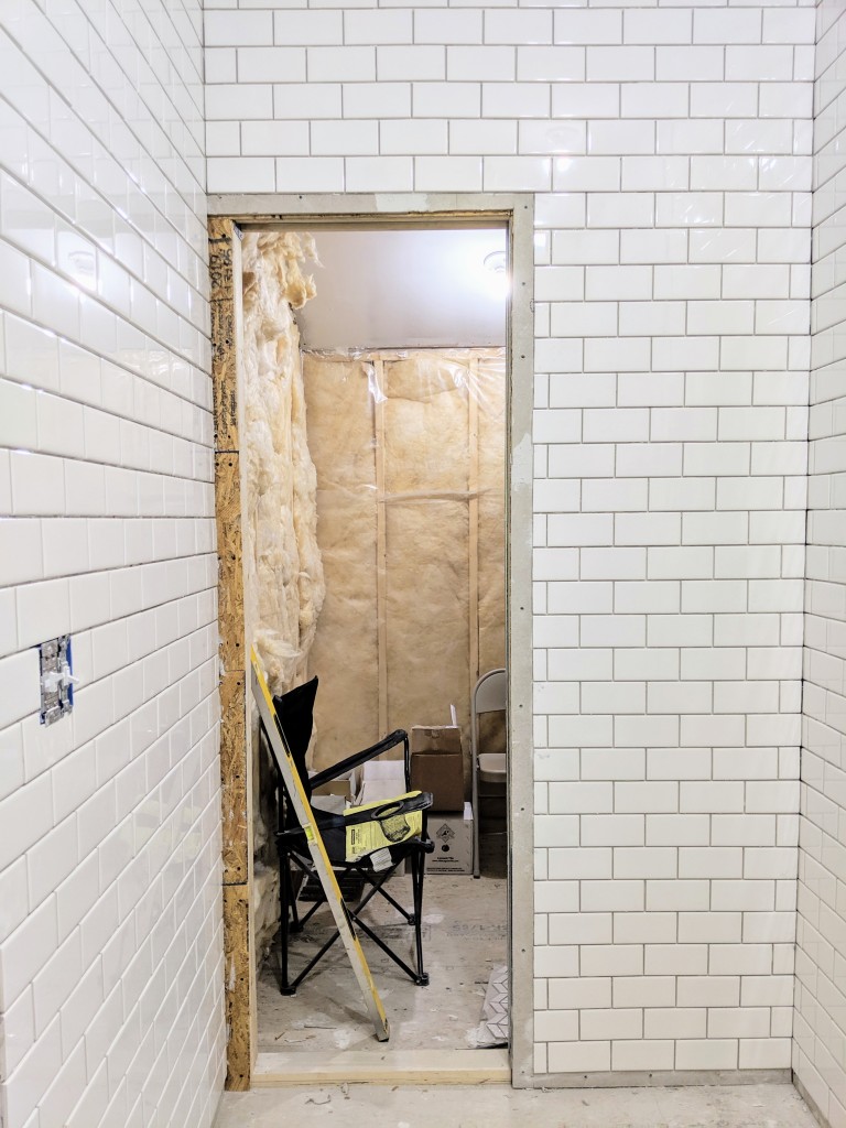
The entry to the master bathroom from our bedroom will feature a sliding door, and the bathroom will eventually lead to our dressing room/closets in the future. I know, more architectural confusion, but that’s par for the course when dealing with a modified A-frame. All this to say that we had to add a pocket door to the back end of the bathroom in order to eventually access other parts of the house. In the foreground, you can see where the framework has been added to accommodate the pocket door.

This is the view from the bathroom into the adjoining space which will eventually lead to our closet areas, right before we installed the pocket door.

So moving on from the mundanity of walls and thresholds…haha! We decided to customize a standard pine cabinet from Lowe’s to create a vanity of our own design…

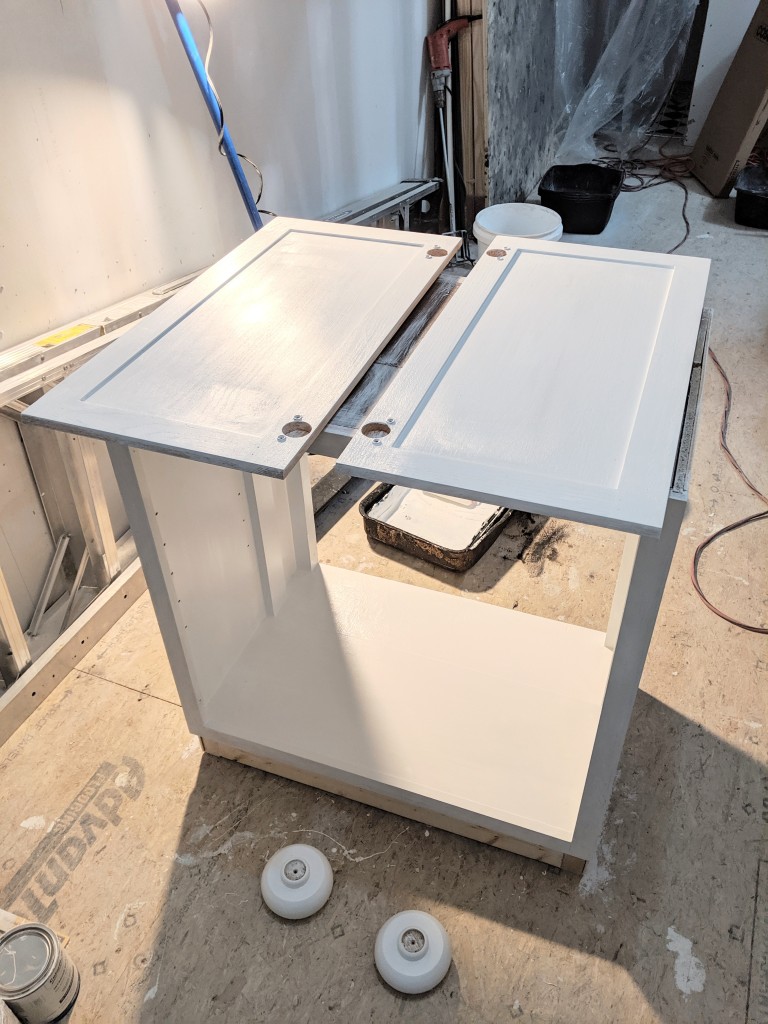
Which evolved into this…

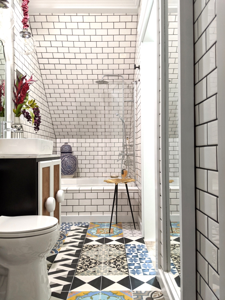
And the flooring was where I wanted the room to show its personality, or should I say, evoke my heritage in a visually symbolic way. Being Portuguese, I have always been enamored with the artisanal beauty of our beloved tile tradition. And despite now living in the woods of New Hampshire, I wanted to be reminded daily of my first home, with its cacophony of colorful tiles, which despite their roots in history, still present beautifully in modern settings. So we used a variety of cement tile patterns, from the riotously chromatic to bold black and white, to create an abstract floor mosaic which would bring life to the space. I wanted this weird, little bathroom to be a sort of glamorous and exotic, old world meets new world refuge because, as we all know, the eye wants to travel…at least mine does!

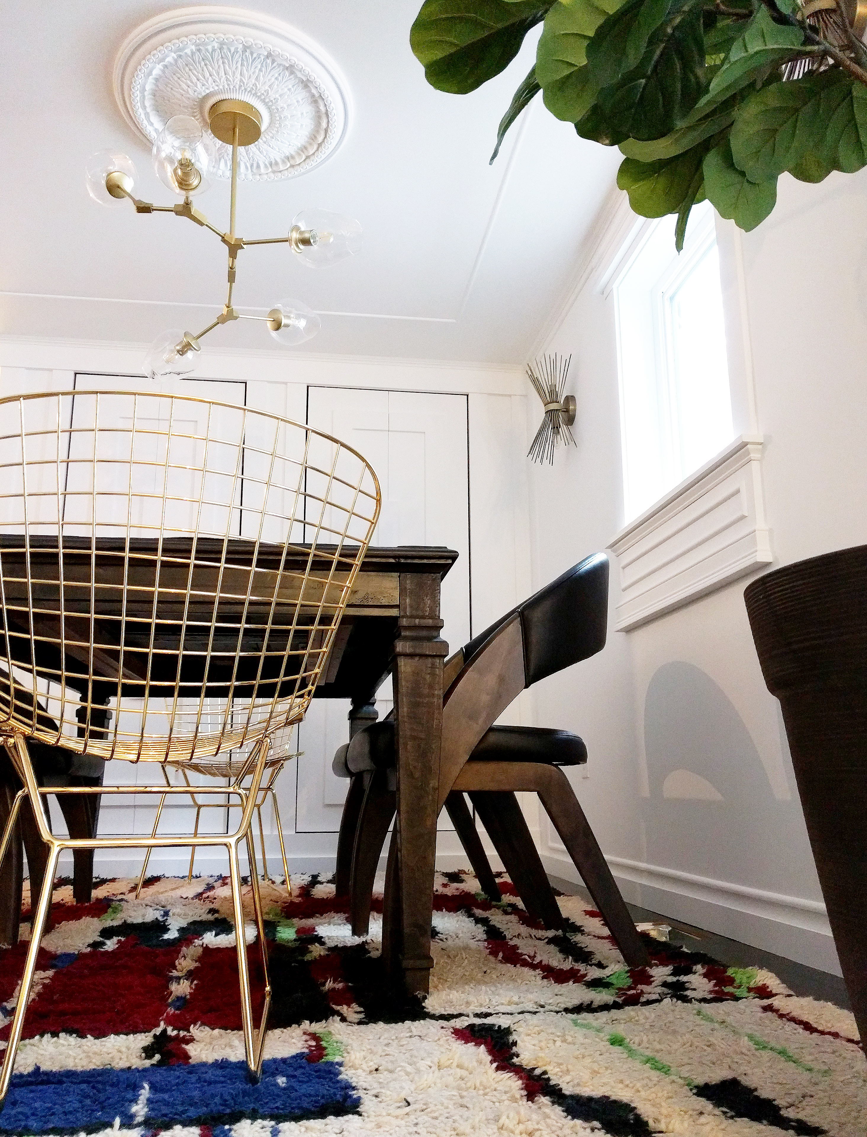
So here is our master bathroom, after all was said and done! I plan on having it professionally photographed in the future, but for purposes of this reveal, my less than optimal cell phone shots will have to do!

This is the long view, taken from behind the pocket door. This perspective gives an idea of the long, narrow shape of this space with the angled wall area where we incorporated the tub and shower.
There are no words for how much I absolutely ADORE this blue Moroccan urn which I purchased from my friend Meg, purveyor of global goods extraordinaire at Tierra del Lagarto … I have to give this amazing shop a shout out for being the most impressively vast resource for decorative wares sourced from all around the world!
The long view from the other side of the bathroom, taken while crouched in the bathtub…haha! Here you can see the fully installed pocket door. The generously sized mirror was a fortuitous salvage find which we framed out and mounted on the wall, and which also helps to bounce light around in this tight space.
We had a thin, marble slab cut for our bathroom vanity, which we topped with a deep, rectangular vessel sink. The mirror was an upcycled, thrifted find from many years ago which has previously lived in other parts of the house, but has now found its permanent home here. Love the ornate detailing and its juxtaposition against the sea of marble and subway tile.
This is the view as you enter from the master bedroom. Currently working out the sliding door situation which will provide privacy!
Some shower details. For decorative effect, we created a chevron-patterned panel to highlight the shower fixture.
Another perspective of the entry. You can see reflections in the vanity mirror of the beam work we’ve working on in the master bedroom. Always juggling a million and one projects around here!
More details. The geometric, wooden accent table (yet another lucky, thrifted find!) is perfect for stacking towels and clothing while soaking in the tub.
We installed a rounded, glass shower door in our tub enclosure. I’ve never been a big fan of shower curtains, and in this case, the bathroom feels infinitely more open with the advantage of the material’s transparency.
Visual moments are all in the details, right? The marble-clad niches make me so incredibly happy, as they provide additional storage and dimension to the walls!
Another layout view, this time from where the toilet is positioned…haha! Here you can see the traditional shower fixture and how we highlighted its placement with the decorative tile panel.
We created a dynamic floor pattern using a variety of bold cement tiles from Villa Lagoon. (Not sponsored, but thought I would disclose the source in case someone was curious!) Great company, with beautiful and well-priced inventory!
I sheathed the orb pendant lights with silk chain covers in a wine color. I absolutely love the tactile and romantic quality it lends to what is an otherwise modern light fixture!
Here is our inset wall cabinet, which has deep storage for stashing towels, toiletries, etc. We also mounted a pair of hooks on the adjacent wall for hanging robes and/or towels.
Partial view of the interior of the inset wall cabinet and niche.
The back (and most practical) end of the bathroom, where we placed a hamper (and trash can, which is essentially obscured in the photo by the toilet).
Customized vanity close-up. We designed it to be a functional but whimsical statement piece in the space, with a nod to art deco design.
Mirror reflections. And that gorgeous blue urn, which was THE perfect treasure to animate and anchor this corner!

And there you have it! Thanks so much for stopping by and accompanying our journey as Brian and I continue to tackle the final spaces in our home. Up ahead…three bedrooms…wish us luck as we try to keep our sanity intact amidst the renovation chaos…haha!

*Images and text by Astrid Insieme

VIGNETTE REVAMPING WITH THE BEAD CHEST

With the holidays a recent memory and the new year upon us, I always feel that our interior spaces need a deliberate dose of refreshing. Not an overhaul, just a well-measured injection of new energy to revitalize the vibe in our homes to better align with the freshness of the new season. Organic elements, in particular, provide such a dynamic accent in home décor as they ground an environment and connect the senses to our more elemental core. And oftentimes, the smallest of details are what deliver the most aesthetic impact in a vignette, which ultimately sets the tone in a designated space. With these notions in mind, I was more than delighted to partner with The Bead Chest once again as I set out to add some novelty and interest to certain pockets of my home!

For those of you unfamiliar with The Bead Chest, they are purveyors of the most vastly impressive selection of beads I have ever come across, ranging from glass beads, to seed beads, to pottery beads, to my personal favorite, chunky and exotic bone beads which are as beautiful worn as they are displayed on a coffee table. I especially love this company’s laudable social mission of carefully sourcing their product through ethical trading in support of developing communities. What’s not to love?

Since I have an undying penchant for all things graphic and global in feel, I chose a combination of bone beads and a delicate strand of blue seed beads in the most enchanting turquoise hue. And here are some images of how I’ve styled them around our house!

bead chest 01

bead chest 04

bead chest 02

bead chest 10

The beauty of these is just how effortlessly they can be added to a space, and yet create such a stunning – and interesting – visual effect! Drape them casually in a bowl, pile them on a shelf for added texture and intrigue…the options are truly endless!

bead chest 05

bead chest 09

bead chest 08

bead chest 06

In partnership with The Bead Chest, they will be offering my readers 15% off all orders! (Just use the discount code AST15 at checkout on their site www.thebeadchest.com!) They are absolutely perfect to wear as is, to incorporate as a decorative home accent, or for use in any kind of creative project you can imagine. Their selections are already incredibly affordable, so this is a deal you definitely want to check out and take advantage of!

bead chest 03

  • I have partnered with The Bead Chest and received product in exchange for this post. All expressed opinions are 100% my own.

*Images and text by Astrid Insieme

GLOBAL EMBELLISHMENTS – THE BEAD CHEST

In my eyes, there is no better way to beautify than to layer on a bit of worldly charm – whether it be in interiors or fashion. (They’re interchangeable in so many ways, after all!) A well-placed touch of the exotic always infuses an element of global appeal, the kind which inspires wanderlust, intrigue and fascination. I’ve long been an aficionado of using artisanal wares of all types from far-flung corners of the world both in my home and my wardrobe, so whenever I come across an amazing source for beautiful product, I want to share it with those who also appreciate the same aesthetic!

The Bead Chest boasts the world’s largest selection of ethnic beads … and that is no exaggeration! Their incredible inventory is absolutely endless, from glass beads, to pottery beads, to bone beads and more – all carefully sourced and with the company mission being dedicated to supporting developing communities through ethical trading.

Here are a few strands of mixed beads, of miscellaneous material and origin (ranging from bone to pottery), which I cannot wait to wear as necklaces once the weather begins to cooperate around here and actually warm up!

BEAD CHEST 05

BEAD CHEST 04

Until then, I’ll be draping them in every pocket of our home. They’re such a gorgeous addition to any interior vignette, and truly add so much visual interest and textural beauty!

BEAD CHEST 03

BEAD CHEST 06

In partnership with The Bead Chest, they will be offering my readers 15% off all orders within the next twenty-four hours! (Just use the discount code ASTRID15 at checkout.) They are perfect to wear as is, to incorporate as a decorative home accent, or for any myriad of creative projects. Their selections are already so very affordable, so this is a deal you certainly want to check out and take advantage of! Have a look and be prepared to be blown away with what you find!

Happy Spring … and happy embellishing!

BEAD CHEST 01


  • I have partnered with The Bead Chest and received product in exchange for this post. All expressed opinions are 100% my own.

*Images and text by Astrid Insieme


YOU’RE INVITED – DINING ROOM REVEAL WITH RAYMOUR & FLANIGAN

When we were deciding how to configure the new spaces in our addition, we knew we didn’t want to expand our kitchen in any way, despite it being miniscule. Some people find a big kitchen indispensable, but what we really lacked in our a-frame was more ample room for living, in general, and entertaining. I absolutely adore cooking and gathering around a table sharing food and wine with loved ones, so it was a priority to squeeze a dining space into the floor plan however we could! The downstairs level of our addition is essentially a large, open space, with a half-bathroom, guest/laundry room and media room off of the “grand room”. I’ve already shown you the living room portion of the open space, and today I’ll be sharing the dining area, which is contiguous to the kitchen. Admittedly, it is a bit of an unusual space because it is where the addition meets the original structure, so there was a rather awkward, angled wall to contend with. Let me show you what I  mean:

DINING ROOM BEFORE 01

The wooden paneling you see in the background is actually the roof of the a-frame, stripped of its shingles. Also, we had a new HVAC system installed to service both the old and new structure, and as a result, unsightly duct work was also something else we had to contend with in that already odd space.  Because the dining room is actually a bit on the small side, we decided to construct huge built-ins (using builder grade bi-fold doors) to plumb out the wall, which would ultimately be super functional for housing all of our dishware and related dining accoutrements. So this is how the process went:

DINING ROOM BUILT-IN 02

First, we framed out the built-ins. The opening between the a-frame and the dining room is on the left; we were only able to demolish the wall after the photo shoot for this post, but for purposes of understanding the layout of the space, that is actually the passageway into the kitchen.

DINING ROOM BUILT-IN 00

So much geometry involved in framing these out! But it allows for so much shelving and storage space for the embarrassing amount of glasses, transferware and tabletop accessories I’ve collected/horded over the years…haha! Oh, and the duct work was enclosed in a cabinet, out of sight but accessible if the need arises.

DINING ROOM BUILT-IN 03

Bi-fold doors in place. Now, time to customize with our own design! Lots of trim work at play here, especially because we didn’t want to incorporate hardware for opening the doors.


DINING ROOM BUILT-IN 04

And then, lots of patching, sanding, priming and painting ensued.

DINING ROOM BEFORE 04

An ornate ceiling medallion was installed as well. I wanted the space to feel both eclectic and elegant with a few special touches via the lighting choices, and ultimately let the furniture make its impact and serve its function. Personally, I prefer dining rooms which breathe a bit given that there is always so much animation and energy contributed by the people who gather in it!

DINING ROOM BEFORE 03

Fully painted and ready for illumination!

DINING ROOM BEFORE 05

And then the real fun began! As I had mentioned, I wanted to create a chic and airy dining room that wasn’t cluttered with the unnecessary. I chose a bold, Moroccan tribal rug from my collection to provide a bit of visual interest and comfort underfoot, and found the PERFECT assemblage of chairs, table and sideboard from my friends at Raymour & Flanigan to pull our little dining room together. There are SO many things I seriously love about this company, one of them being the sheer magnitude of variety they offer in terms of furniture styles. It’s truly such an asset to their brand! I’m the kind of person who generally appreciates a mix and match approach when it comes to decorating, and this is especially the case in a dining room setting. Meaning, I tend to steer clear of “sets” of any kind. I find that it always feels more unique, personalized and surprising to design a room with a looser and more imaginative approach…because I’m a believer that beauty is always found in the unexpected!

DINING ROOM 00

Like I said, I chose pieces which were essentially from four different sets. I wanted a robust, wooden table with unfussy lines and the option of a leaf (for when I’m entertaining bigger groups) and the Sutton Place Dining Table was exactly what I had in mind. It’s seriously perfect, with such a gorgeous patina!

I really wanted to mix up the seating not only in terms of their design, but also material. The masculine solidity of the Prato Dining Armchair, with its striking curvature and incredible craftsmanship, juxtaposed against the wiry, mid-century lines of the brass Penelope Chair provide the perfect contrast I was seeking for this grouping.

DINING ROOM 02

DINING ROOM 03

I fell in love with the Echo Park Buffet because of its incredibly handsome carvings and felt that its Brutalist style meshed beautifully with the rest of the chosen pieces. It’s a rather substantial sideboard/buffet offering lots of interior storage and was from an entirely different set, of course, but all of the elements interact so well with each other.

SIDEBOARD AND CHAIR

I had painted a canvas specifically to hang over it, which I then flanked with some vintage table lamps from my stash.

SIDEBOARD 04

SIDEBOARD 07

And there you have it…the makings of our little dining room which I cannot wait to put to good use and make endless memories in!

DINING ROOM 04

DINING ROOM 01


  • I have partnered with Raymour & Flanigan and received product in exchange for this post. All expressed opinions are 100% my own.

*Images and text by Astrid Insieme


A TOUCH OF ST. FRANK

The tiny living room in our A-frame is just that – tiny. So tiny, that it borders on the comical and believe me, hyperbole is not being employed here! That being said, I’ve tried to make it as cozy as possible given its diminutive dimensions and imbued it with an undercurrent of worldly personality as is always the case in my interiors, and this spatially limited room has actually become rather livable and inviting (or so I’ve been told!). But I’ve always felt like something was missing from the space. The one wall in the room is steeply angled and has been adorned with a mirror and artwork in its previous iterations, but I knew that what was ultimately needed to make the room feel entirely pulled together and polished would be something large-scale, ornamental, textural and subtly elegant without being overwhelming. So when I was approached by St. Frank to partner in revamping this spot in our home, I was seriously beyond thrilled! It was such a wonderful and timely opportunity to collaborate with a company that I had long esteemed for both their incredible collection of global home wares and their laudable mission of supporting artisans around the world in their very signature approach of socially-conscious commerce.

I chose a gloriously substantial ivory juju hat from the Cameroon, which are traditionally crafted and worn by the Bamileke tribe during their ritual ceremonies. And I couldn’t be more ecstatic with how perfect it feels in the room!

juju living room 6

juju living room 7

juju living room 4

juju living room 1

St. Frank is a lifestyle company which was created to satisfy a niche in the market for global goods which are ethically sourced and which elevate traditional, artisanal wares into luxe collectibles – simultaneously providing sustainable work partnerships with craftspeople around the world while celebrating the true uniqueness, cultural relevance and authentic artistry of these exotic items. The brand’s namesake pays homage to San Francisco, the city where it was founded and where their flagship store is located, as well as to St. Francis of Assisi, who was the son of an established textile merchant and who dedicated his life to the poor and underprivileged. In this same spirit, the company has dedicated itself to preserving age-old craftsmanship through a fair-trade approach of working with artisans and cooperatives worldwide. With an absolutely incredible collection of gorgeous pieces ranging from their signature framed textiles to soft furnishings and decorative items, there is something from every corner of the globe and for every spot in the home!

3 copy 2

store-6

unnamed (1)

reduced reflections -1

untitled-3

store-3

untitled-2

unnamed (2)

untitled-5

Window vignette

Check out St. Frank online, at their shop in San Francisco, CA, or at their upcoming new location in East Hampton, NY for more haute-boheme beauty!

  • I have partnered with St. Frank and received product in exchange for this post. All expressed opinions are 100% my own.

*Text and images of juju hat in living room by Astrid Insieme. All other photos provided by St. Frank.


ALL DECKED OUT WITH RAYMOUR & FLANIGAN

After the excessively brutal winter we experienced here in New Hampshire, there was no prospect more exciting than preparing for outdoor living as the days began to lengthen and the temperatures slowly but surely rose. Well, the planning actually began in the form of desperate fantasizing about lounging in the sun and nighttime cocktails on the deck as we were pummeled with blizzard after blizzard…haha! We live in a wooded area by a lake and because nature plays such an integral role in our day-to-day backdrop, we’ve made it a point during the renovation of our property to maximize the potential for enjoying our surroundings during those very short months when the weather actually permits it. And here in New England, that essentially translates to deck living.  After the framework to our addition was completed last spring, we built decks in the front and back of our modified A-frame and constructed an attached pergola on the back deck. Although we have a sizeable yard in the back (which is now seeded, thankfully, and no longer a lunar-like wasteland of of weeds, rocky soil and construction debris), our intention was to create one long, expansive space where all of the entertaining/lounging areas would be concentrated. We managed to have all of the structures built and stained/painted before last winter, but we didn’t have the opportunity to actually “deck” it out and properly enjoy it. Until now. I’ve styled it up in partnership with the amazing people at Raymour & Flanigan and it is ready for the season!

So for the sake of visualizing the evolution of this project, I’ll share some before shots:

DECK MAKEOVER BUILD

This was taken last summer as the back deck was being built. Yes, we’ve been living in a perpetual construction site. Check out that luscious lawn!

DECK MAKEOVER PERGOLA

At this point, the attached pergola had just been built and we were about to embark on the always fun stage of endless painting and staining. Irony intended.

Fast forward to over a month ago, when the outdoor furniture from Raymour & Flanigan was delivered! I chose the Tilley Outdoor Sofa and the Tilley Outdoor Chair (I got a pair) to create an outdoor living room beneath the pergola. I was so incredibly excited to see these gorgeous pieces in place, with their incredibly clean, modern lines and deep seating, that I couldn’t help but temporarily set it up, even though there was still quite a bit of prep work needing to be addressed before the install.

BEFORE DECK MAKEOVER

As soon as the weather was warm enough to actually start working outside, we started with retouching all of the white paint on the pergola and restaining the entire back deck because unfortunately, even treated wood takes quite a beating from the harsh elements here in New England.

DECK MAKEOVER BEFORE 1

We also installed waterproof, bamboo blinds on the three (exposed) sides of the pergola so that we’d have the option of sun filtering on those super bright days. And for ambient lighting in the evenings, we hung string lights and a cluster of solar pendant lights which were an easy DIY hack we fashioned using five rattan-style baskets (they’re actually resin-coated, because as you can imagine, everything stays out and needs to be weatherproof around here!).

DECK MAKEOVER BEFORE 2

Now the decorating fun begins. Notice the mammoth pillow pile in the back…those are the Sunbrella cushions for the sofa and chair set.  I have never seen or sat on cushier things in my life! I am strangely obsessed with them.

DECK MAKEOVER BEFORE 3

And so with the outdoor rug down and the seating intact, I brought in greenery and items from my personal hoard (decorative pillows, textiles and tables, etc.) to pull this outdoor space together. Ultimately, I wanted it to be comfortable and inviting; after all, this is where we are going to do some serious lounging, whether chilling out as a family or entertaining. It is where we will have lazy coffees in the morning and unwind after a grilled meal in the evening with drinks. And of course, I wanted it to feel like a bit of an escape. A sensorial retreat from reality…like a vacation, but conveniently, at home. Everything is weatherproof and can be left out in the rain, except for my kilim pillows which I just toss into one of our sheds when the weather promises to be inclement. And voila…

AFTER DECK MAKEOVER 5

AFTER DECK MAKEOVER 9

AFTER DECK MAKEOVER 10

AFTER DECK MAKEOVER 13

AFTER DECK MAKEOVER 8

AFTER DECK MAKEOVER 3

AFTER DECK MAKEOVER 15

AFTER DECK MAKEOVER 6

AFTER DECK MAKEOVER 7

Can’t get over the stunning, modern design and roominess of these pieces! I also fell in love with their black Coil Solar Outdoor Lantern and got a few for scattering around on the floor and on tabletops.

AFTER DECK MAKEOVER 12

AFTER DECK MAKEOVER 14

AFTER DECK MAKEOVER 4

And there you have it! It took a while, but this deck is finally transformed and more than ready for what is guaranteed to be much use until the cold weather kicks in again! Cheers to spring and summer on the horizon!

  • I have partnered with Raymour & Flanigan and received product in exchange for this post. All expressed opinions are 100% my own.

*Images and text by Astrid Insieme

#BOHOFOLKDECOR WITH LOLA Y TULA

When it comes to defining my personal style – or at least the aesthetic that most resonates with me – it always incorporates elements of the exotic. Worldly environments that are global and artful in their appeal are especially meaningful and inspiring to me because they feel most authentic, for the simple reason that there is an uncontrived, cultural richness and boldness imparted by those special pieces which speak of other lands and their traditions.

So in collaboration with Gardenia, the amazing woman behind the California-based brand, Lola y Tula, we have decided to embrace and celebrate what we both collectively identify with and love in the vast realm of design. #BOHOFOLKDECOR encompasses two essential notions – a penchant for bohemian style and an appreciation for that which is considered “folk”. It is that always original vibe which is an organic and unpretentious fusion of the free-spirited and unconventional with the artisanal.

Here I’ve styled some incredibly unique pieces from Gardenia’s beautifully curated collection of Mexican soft furnishings, including her otomi pillows and Tlaxcala geometric blanket, in the spirit of #BOHOFOLKDECOR … won’t you join us and show us your interpretations too?

LOLA Y TULA 5

Stunning otomi pillows with their whimsical depictions of animalia and delightfully colored thread work.

LOLA Y TULA 3

LOLA Y TULA 2

LOLA Y TULA 7

Playful and saturated hues make these soft goods an absolute chromatic sensation!

LOLA Y TULA 4

This Tlaxcala geometric throw is a stunner with its bold and graphic pattern … perfect for draping on a bed or sofa, curling up with on a chilly evening outdoors, and versatile enough to be used as a beach or picnic blanket.

LOLA Y TULA 1

#BOHOFOLKDECOR vibes…

LOLA Y TULA 6

Don’t forget to check out Lola y Tula to view her full gallery of artisanal offerings which honor the heritage of Mexican artistry and craftsmanship! And don’t forget to showcase your #BOHOFOLKDECOR on Instagram … we’d love to see!

*Images and text by Astrid Insieme

AN ECLECTIC HOLIDAY HOME TOUR

So, it’s that time of year…and how quickly it descended upon us! I’m very excited to be participating, alongside so many talented creatives, in the Winter Eclectic Home Tour hosted by the amazing Jess of Domicile 37 (thanks for organizing this blog hop and the invite, Jess!). If you’ve made your way over from Monica Wants It, welcome!

For those who are new here, I thought it would be apropos to preface by disclosing a few things about our lifestyle before jumping into the visuals. We are a family of three who live in the woods of New Hampshire, in a tiny A-frame cottage which is currently in the throes of a renovation; we’ve recently added on an addition which is still a work in progress, but for the moment, our actual living area is simply comprised of the A-frame which totals just under 800 square feet. With steeply angled walls. So as you can imagine, it is a very small home with some very particular and unusual spatial limitations! However, this conveniently aligns with my penchant for a “less is more” approach to decorating for the holidays, despite my otherwise maximalist leanings when it comes to interiors. As far as “decking our halls”, I prefer incorporating a few subtle and intentional flourishes which remind us of the celebratory season, and rely mostly on cultivating a cozy, layered, and wintry mood throughout. The vibe (hopefully!) translates to an unfussy melange of eclectic/bohemian/Scandinavian/rustic styles with a touch of Christmas cheer.

OK, that’s enough of my virtual babbling…come on in!

facade-1

So here is the entry to our little A-frame which I always spruce up with greenery this time of year, opting to keep things rather elemental and natural. Except, of course, for the star perched atop the peak of our roof…haha!

new-facade-2

This is the view from our front door as you enter a narrow foyer which leads into our open-plan downstairs.  The foyer essentially serves as a mudroom where we stash our shoes, hats, umbrellas, etc. and although the space is primarily utilitarian in purpose, there’s always room for some seasonal dressing in the form of garlands and wreaths, right?

foyer-001

foyer-1

A square, boxwood wreath and some pine boughs gathered from trees on our property provide just enough deliberate doses of green while not overwhelming the tight space.

foyer-2

This is a bit of an odd photo, but it shows the layout of the open-plan downstairs, and the placement of the kitchen (in the background) in relation to the living area. The stairs lead upstairs to two tiny bedrooms and an even tinier loft.

living-room-01

I like surprising and unconventional mixes in my decor, as I tend to find beauty in the unexpected. Global, traditional and rustic aesthetics juxtapose effortlessly, I feel, and still manage to feel discreetly festive. I truly believe that if you do anything with conviction and wild abandon, it will always work!

living-room-02

We can’t hang our stockings by the chimney with care…so they hang by our sliding glass doors, dangling (carefully?) from a curtain rod. And please behold our baby tree beneath…haha! Yep, that’s about as much tree as we can fit in our living room at the moment!

living-room-04

Some more living room details, keeping it minimal but still evocative of the holiday spirit:

living-room-06

living-room-05

And a close-up of our baby tree. All 15 inches of her! I love her though…she seriously cracks me up.

living-room-07

Shall we head outside to our back deck? Here is where we can appreciate the woods on the edge of our property, so this space is all about experiencing the rusticity of cabin life. Bundled up, we can still enjoy a quick morning coffee or glass(es) of wine in the late afternoon here. But not for too much longer, as the temperatures are dropping quickly!

outside-deck-1

outside-deck-3

new-outside-deck-5

So, the reality is that I had finished taking all the photos that I intended to include in this holiday home tour last week. But then Mother Nature intervened a few days ago, rather opportunely, and this happened…and so I thought it would be a perfect, final shot for this wintry blog hop!

winter-wonderland

And that’s how we do the holidays around here! Thanks so much for stopping by, and don’t forget to pay a visit next to Mila of Jest Cafe to see how she works her seasonal magic, as well as all of the other talented creatives (listed below) who participated in this week’s Winter Eclectic Home Tour. Happy Holidays, everyone!

winter-eclectic-home-tour-3

(Please Note: Links to Home Tours are not live until day of tour!)

Monday

Bright Green Door // Michelle Matangi Home // Sharon Williams // CAD Interiors // Domicile 37

Tuesday

Casa Watkins Living //  Maggie Overby Studios // House Homemade // French & French Interiors // Style Mutt Home

Wednesday

Up to Date Interiors // The Striped House // Designing Vibes // Iris Nacole // Fearfully & Wonderfully Made // Blue i Style

Thursday

PMQ for Two // Maker of Home // Go Haus Go // Whimsical Blue Living // FOXY OXIE

Friday

This is Our Bliss // Monica Wants It // Insieme House // Jest Cafe // The Gathered Home